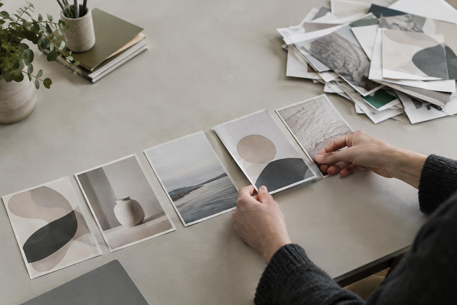
Showing the finished work without explaining the assignment
A polished image can catch someone’s attention, but it rarely answers the questions needed to evaluate a project. What was the work meant to do? Who was it for? What constraints shaped the result? Without that context, a thoughtful solution may look like a purely visual exercise. Visitors are left to guess whether the work solved a real problem or simply followed your personal taste.
Give each featured project a short introduction that names the goal, audience, scope, and any constraint that affected your choices. Keep it proportionate: a small project may need only a few sentences, while a complex one may benefit from a fuller case study. If a project was self-initiated, say so. You can still explain the brief you set for yourself and how you judged whether the outcome met it.
Making your contribution hard to identify
Collaborative projects often produce excellent portfolio pieces, but vague descriptions make it difficult to understand what you actually did. A visitor should not have to infer your role from a list of deliverables or assume that you handled every part of the project. The same problem arises when a project page describes what “we” achieved without distinguishing your decisions from the team’s.
State your responsibilities plainly, especially when the work involved collaborators, a client team, or an existing design system. For example, you might identify which concepts you developed, which assets you produced, and which decisions you helped make. Credit collaborators where appropriate. Clear boundaries do not weaken a project; they let readers evaluate your skills fairly and see how you work with others.
Displaying too much without a clear path through it
More examples do not always make a stronger portfolio. When every experiment, revision, and finished piece receives equal prominence, visitors must sort out your strongest work for themselves. Long image galleries without labels can create a similar problem: the viewer sees plenty of output but cannot tell what to notice or how the pieces relate.
Select projects that demonstrate the kind of work you want to do, then arrange them so a visitor can quickly understand the range of your skills. On each project page, lead with the finished result, provide enough context to orient the reader, and use captions to explain important details. Include sketches or iterations when they reveal a meaningful decision, not simply to prove that you made many versions. A smaller, well-explained selection is often easier to evaluate than a large archive.
Describing the process but not the decisions
A familiar sequence of discovery, exploration, and delivery may sound complete while saying little about how you think. Portfolio readers need more than a list of phases. They need to see why you chose one direction over another, how a constraint affected the work, or what changed after you received feedback. Otherwise, the process becomes a timeline rather than evidence of judgment.
Choose one or two decisions that mattered and explain them in concrete language. Perhaps you simplified a navigation structure because the original made key information difficult to find, or adjusted a visual system so it could work across different formats. If you cannot verify an outcome, avoid claiming that the project improved a business result. Describe what you delivered, what you observed, and what remains unknown. Honest limits make the account more useful than unsupported success claims.
Overlooking the experience of viewing the portfolio
Even strong case studies can be undermined by a portfolio that is difficult to use. Tiny text, images without helpful descriptions, inconsistent navigation, or project pages that offer no obvious way back can interrupt someone who is trying to review your work. A contact link buried several pages deep creates one more obstacle for a person who wants to follow up.
Review your portfolio as a first-time visitor would. Can you understand what the maker does from the opening page? Can you scan project summaries before committing to a long case study? Do images have enough context to make sense, and is important text readable on a phone? Finally, make the next step clear with a simple contact option. The aim is not to eliminate every possible question. It is to remove avoidable confusion so the quality of your work is easier to see.