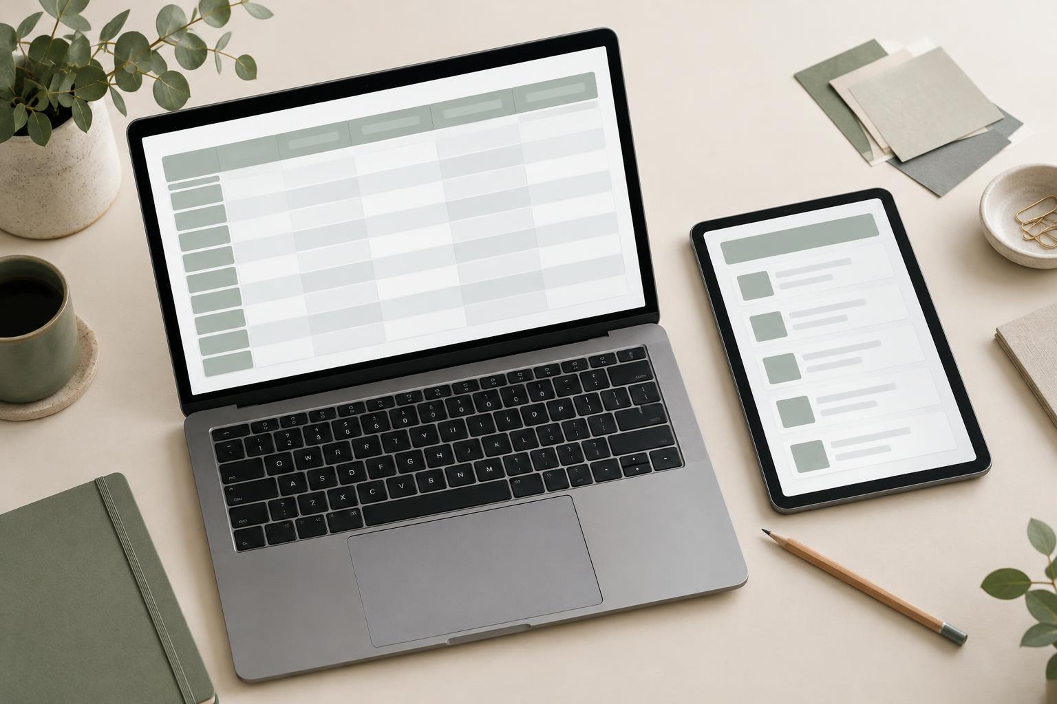
Start with the comparison people need to make
A table is useful when readers need to compare the same kinds of information across several items. Before drawing borders or choosing colors, write down the question the table should answer. Someone reviewing project tasks might need to see what is due next and who owns each task. A list of names and descriptions alone may not serve that purpose; columns for status, owner, and due date might.
Include only columns that help with the intended comparison or a likely next action. Extra columns make each row harder to scan and leave less room for meaningful content. If readers need a long explanation of an item, consider placing that detail on a separate page or in an expandable view rather than squeezing it into a narrow cell. The table should provide a useful overview, not carry every possible detail.
Make labels and values predictable
Use short, specific column headings. “Date” may be ambiguous if a project has both a start date and a deadline; “Due date” tells readers what they are looking at. Keep the same type of information in each column, and use a consistent format for values of the same kind. Predictability lets someone move down a column without repeatedly interpreting what each cell means.
Decide how to display missing or uncertain values, too. An empty cell can look like a loading problem or an oversight. A plain label such as “Not assigned” often gives more context, provided it accurately describes the situation. If you are practicing this skill with sample content, browse Learning Projects · Everyday Learning Journal for ideas for small learning projects, then create a table whose labels and values can be understood without an accompanying explanation.
Use layout to support scanning
Align text in a way that makes each column easy to follow. Left alignment usually works well for names and descriptions; right alignment can help readers compare numbers with the same units. Give long text enough room to remain readable, but do not let one descriptive column push every other column off screen. Test the layout with realistic entries, including the longest names or values you expect to display.
Spacing and dividers should clarify where rows begin and end without becoming the most noticeable part of the design. A little padding inside cells often does more for readability than heavy borders. If rows contain actions, place those actions consistently so people can find them without searching each row. Avoid relying on color alone to convey status: a text label remains understandable when colors are hard to distinguish or the table is viewed without them.
Plan for narrow screens rather than shrinking everything
A wide table will not always fit comfortably on a phone. Reducing text size until every column fits may make it difficult to read or tap. Instead, identify which columns are essential to the main task. One option is a horizontally scrollable table with clear column headings and an obvious indication that more content is available. Another is a compact layout that shows key fields first and reveals secondary fields when an item is opened.
Neither approach works for every table. Horizontal scrolling can preserve comparison across rows, while a compact item view can give long descriptions more space. Try both with your actual content and the actions readers need to take. For more prompts that may help you explore alternative layouts, browse Creative Thinking · Everyday Learning Journal, then sketch a couple of approaches before committing to one.
Check the table with a simple task
Once the table is populated, test it by asking a concrete question: Which task is due first? Which item has no owner? Can a reader find the row they need and understand its status? Attempt the task at a desktop width and a narrow width. Notice whether headings remain available, values are legible, and the relationship between each cell and its row stays clear.
Also check what happens when the table has few rows, many rows, missing values, and unusually long content. These cases can expose problems that a tidy sample hides. Make one change at a time—perhaps removing an unnecessary column, clarifying a heading, or increasing cell padding—and repeat the task. A well-designed table is not simply neat; it makes a particular comparison easier to complete.